August 22, 2004
The art chasm
While I was writing this piece, I was thinking about how to find the threshold at which an idea is too confusing for what should be its target audience. I don't have a good answer to that, but I started thinking about the art market as an idea market.
This made me think that there may be a similar chasm in art, which would imply that there's a similar chasm in all idea adoption. Look at the Moore curve again:
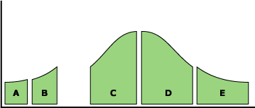
If the slices are relabled as follows, it still makes some sense:
A: avant-garde
B: experimental
C: mainstream
D: cliché
E: kitsch
Now, of course, the size of the slices doesn't represent the market size--there's a lot of kitsch out there--but maybe it represents the visibility of the style or the recognition of the style as "interesting." Anyway, it seems to make sense, though I haven't quite figured out how.
Ideachasms
I've been thinking about the adoption of new ideas lately, both in companies and in the market at large. Inspired by the Cambrian Explosion and subsequent die-off, I've been thinking about what happens to people's perceptions when new ideas come along.
Thought 1: Idea definitions narrow with time
When a substantial new idea appears, the boundaries of the definition of that idea are not known. There are many different interpretations of the idea. However, as time goes on, the number of new definitions slows, the idea space is explored, fewer variations appear and, finally, the number of things that define a concept are reduced. This looks like this: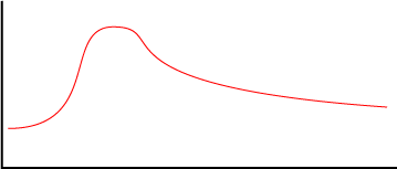
Thought 2: A comprehension threshold
There is a point at which the number of variations on an idea becomes too great to communicate a coherent version of that idea to an uninitiated audience. In other words, if there are too many alternative interpretations of an idea to choose from, if someone hasnt been primed by experience with similar ideas, or by in-depth research to understand the commonality between all of the variations on an idea, they won't get it. Or if they get it, they'll either get a rudimentary version of it or a distorted, incorrect, one.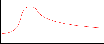
NOTE: I'm intentionally simplifying this. In reality, I think that exposure to ideas makes them more comprehensible, so the right edge of the threshold is likely higher than the left, but for the sake of this discussion, I've made it a simple horizontal line.
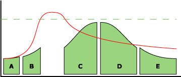
Thought 3: Comprehension thresholds create Moore's chasm
Geoffrey Moore defined a chasm in new technology adoption in his book "Crossing the Chasm." In it, he divides the adoption market for a given technology into 5 divisions:
A: Technology enthusiasts
B: Visionaries
C: Pragmatists
D: Conservatives
E: Skeptics
Note: I've cut off the two most trailing ends of the bell curvetheoretically it goes all the way to 0 on both ends.
The graph represents market size for sections of a market, but it can also be read left to right as the sequence in which a technology is adopted, which is how Moore's chasm appears (roughly speaking, of coursein reality, the gaps represents the difficulty of reaching a market, not time, but it's a reasonable abstract model). His insight is that, for some reason, it's hard to get Pragmatists to adopt a new idea and it may take a lot of energy, time or money to cross it. Moore's theory is that Pragmatists want something that "just works," unlike Technology Enthusiasts, who like the tech for the sake of the tech, or Visionaries, who are enamored with what the tech could be.
But what does "just works" mean? Moore talks about the qualities Pragmatists are looking for in a productthat it be stable, reliable, supported, etcbut I have a different theory. I think that they buy the product when they can be bothered to understand the idea it represents (and thus, the idea's value), and they only understand the idea when the number of competing variations is small enough to not be confusing. In other words, until the number of competing variations on an idea drops below the comprehension threshold, Pragmatists won't care to understand it.
This means that the chasm is that period between the time when an idea crosses the confusion threshold and the time that the number of variations drops to the point that people care to grok what it means (and it's not that they can't understand it, it's just that there are too many options for them to filter through).
Thought 4: Idea variations are embodied in products
For people to be exposed to an idea, there has to be some way it's introduced to them. With product-based ideas, that way is, tautologically, through exposure to products. The graph of idea variations can be read as the number of products on the market that represent a certain idea, with each product a variation. It can also be read as the number of features offered on all the products currently on the market. Initially, when there's a new product idea, it's followed by an explosion of variants, but at some point the complexity of the product variants starts to drop. My claim is that it's only after this has dropped for a while, and the variants have been winnowed to those that are actually successful, that the mainstream market will adopt the idea.Thought 5: User research rapidly reduces competing ideas
So far this is an evolutionary theory of idea success in the marketplace (and a simple one at that). To a large extent, I believe that's going to happen no matter what, but I also believe that user research can accelerate the evolution substantially, and to raise the chances of an idea's success in the mainstream market. If the variations on an idea are researched in the Early Adopter stage, it may be possible to identify ones that particularly confuse Pragmatists (the noise in the signal, from their perspective) and eliminate those from products targeted to them. To some extent, I think that this is what we user researchers have been doing all along, but as an explanation for why it's useful, and when it's useful, this set of ideas seems pretty satisfying (at the moment, anyway ;-).August 20, 2004
MIT SmartSink
Cassidy brought me back a pamphlet describing MIT's SmartSink(a PDF paper describing the thing).
Here's the abstract, which pretty much describes it:
Considering its central role, the kitchen sink is considerably
dumber than its fellow appliances. We have built a contextaware
kitchen sink that anticipates your needs and can be
operated in a totally hands-free manner. The fixture adjusts
to your height automatically, chooses when to dispense
water and adjusts the temperature of the water based on
your needs. The water and sink surfaces act as graphical
interfaces to report the status of the water and the sink.
SmartSink is a rugged kinetic kitchen sink that can move
up and down with its supply and drain lines. Its surface is
made from soft, strong materials that absorb noise and
minimize breaking dishes. As a context-aware appliance,
SmartSink allows the user to remain concentrated on the
task at hand, only offering information in an unobtrusive
manner.
And, as to be expected from what I've said before, I agree with their concluding discussion:
SmartSink is a highly context-aware kichen appliance. The digital augmentation of traditionally simple devices can greatly enhance the comfort, safety and efficiency of tasks. In this case, SmartSink should allow users to keep their eyes and hands completely occupied with their task whenever they use the sink. The vertical adjustment should increase the comfort and accessibility of the sink.
In other words, they're looking at what people do with sinks now and are trying everything they can to augment those actions. I'd maybe quibble with the assumption that people never want to look at the sink as they do their task (what about using the contents of a sink as context for what has been done?), but it's a small point. I like the project.
And this shows that they have everything at SIGGRAPH. ;-) Thanks, Cassidy.
August 19, 2004
Agile/UI Bibliography
I promised the participants in our workshop yesterday (hi! thank you all so much for a great workshop) that I'd post the bibliography to all the stuff I mentioned in class. Here it is (linked to Amazon):
Garrett, Jesse James, The Elements of User Experience (Jesse's diagram is available for free and he has built a site devoted to the book).
Snyder, Carolyn, Paper Prototyping
Tufte, Edward, The Visual Display of Quantitative Information
Kuniavsky, Mike, Observing the User Experience
Highsmith, Jim, Agile Software Development Ecosystems
Jeffries, Ron, et al, Extreme Programming Installed
My rough hand-drawn UI templates.
The Wiki William and I have been using to organize the class, which we'll be adding additional class resources to as we figure them out. Be warned, though, it's still pretty rough right now. It's mostly notes for ourselves.
August 17, 2004
Paper Prototyping UI Elements
We're going to be doing some paper prototyping in the workshop that I'm going to teach tomorrow in Calgary (we're working from Carolyn Snyder's excellent book on the subject). So people wouldn't have to make every little button from scratch, I decided that it may be useful to have some basic UI elements on a template that people could cut out. Not finding a template that looked rough enough, I quickly made my own. It's suitably rough. ;-) And, here, how you can use it, too:
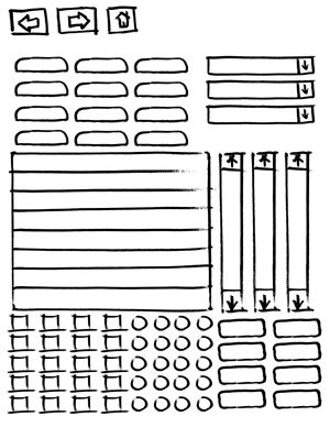
It's a 70K PDF and all the elements are oversize, so that it's easier to write in/on them. Have fun and let me know if it's of any use.
August 15, 2004
Kiwi bed innovations
Beds which are more supportive on one side for a heavier partner have been around for some time.But in recent years Sleepyhead has poured millions of dollars into making beds which can be configured to more exact individual needs. They sell for more than $10,000 each and are proving popular.
In Sleepyhead catches Oz napping.
This describes a market need for custom mattresses which could form the platform for self-adjusting beds, with additional information processing. Right now I think adjustable beds are barely more than the kind of informercial-style taco-shaped bed things that look like they're out of a nursing home, but maybe there's a larger market than that.
August 12, 2004
Wave Pillow and New Inventors
Thanks to BitTorrent, I watched an episode of the Australian TV show, The New Inventors. It seems like a decent show--a gentle cross between Monster Garage and American Idol--and very Australian (two of the three segments were about surfing and beer). (Here's the Suprnova link to the torrent).
One of the segments featured a pillow that would vibrate based on wave activity at a given surf break, so sleepy surfers can tell without getting out of bed whether to run down to the beach at 6AM or sleep until noon. It's a nice piece of interaction design and, not surprisingly, it's created by an interaction designer, Elmar Trefz (who, although Australian, was at one point one of Amy Franceschini's futurefarmers--somehow I'm not surprised this mix of interaction design, art, tech and surfing is associated with the Bay Area). The WavePillow, as its called, has its own site.
It's nice seeing ideas like "ambient display" percolating into popular culture (though without the terminology--maybe that's for the best). The judges on the show thought it was a bit too narrow in its market, but seemed to like the ideas and didn't think it was particularly outlandish. That (once again) says to me that augmenting familiar objects makes the ideas more acceptable.
August 09, 2004
Stain repellant fabrics as social litmus test
I can't tell if the following quotation about why Thomasville is using a new generation of stain-repellent fabrics is deep insight into the social effects of tragedy on consumption, a myopic oversimplification, crass sensationalism, or all three:
"After the events of 9-11, we decided collectively as a culture that it's our friends and our families that matter, not our stuff," says Sharon Bosworth, Thomasville's vice president of upholstery design."The best thing is to get people to come to our house. You can't have that kind of life unless you take the velvet ropes off. Children and pets can go anywhere. People are invited into every nook and cranny. Nobody is going to say, `I can't stand her because she spilled red wine on my sofa.' We count our riches these days in friendship."
From Superfabrics: Imagine a plush sofa that can repel mustard.
"Remote Furniture" at SIGGRAPH
Ben called to tell me that he'd seen Noriyuki Fujimura's "Remote Furniture" rocking chair piece at SIGGRAPH in their emerging technologies section.
Fujimura describes the piece thus:
Each chair has a sensor and motor.These devices enable mutual interaction between the chairs. They allow one to feel the other's rocking action. The aim of "Remote Furniture," then, is to create direct and tactile touch.
The piece is designed as a nonverbal conversation between two people rocking on the chairs. It seems like much contemporary Japanese tech art, it's using technology to comment on the relationship between traditional Japanese values and how they relate to Western material culture (i.e. how the design of American and European stuff is interpreted in Japan). High tech seems to be a particularly good vehicle for this, since it is itself a hybrid Japanese-Western product.
Although it was originally presented as art--and I think it's still more expressive than functional--it's definitely on the continuum of what I see as smart furniture. It's extending familiar objects while creating subtle new ways of interacting, without requiring a large investment from the people using the things. I also see a relationship to Scott Snibbe's two fan pieces, Circular Breathing and Mirror, though those are much closer to pure art.
I think it's a great. I'm looking forward to seeing it in person at some point, though I sadly won't be making it down to LA for SIGGRAPH this week.
August 06, 2004
Adam on Smart Furniture
Adam, ever the agitator, wrote thoughtful and challenging response to my Smart Furniture Manifesto. I can't not respond to it, but it'll take me a bit. In the meantime, enjoy his thoughtful analysis. Thank you, Adam!
August 03, 2004
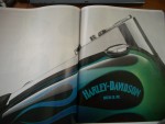
The Harley Catalog
One of my favorite brand experiences arrived in the mail today, the Harley Davidson 2005 catalog. I don't own a Harley (I ride an old Kawasaki) and I don't particularly like the bikes...but, oh, the catalog. It's the size of a phone book, with full-color pictures on every page and it takes the "brand promise" of technology fetishization to an amazing extreme. Starting from the beginning, where the catalog suggests that
Before customizing your VRSC model, you should get to know it from front to back. Identifying where parts are located and the impact they have on your bike is a crucial part of the process.
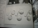
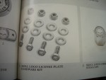
it's all about the minutia of decorating, personalizing, worshipping your motorcycle. To help you maximize the impact, they custom make variations of every single part on the bike. The catalog realizes that people don't buy Harleys to ride Harleys, they buy them to customize them, to project themselves, not to use them. Riding is secondary, and--in fact--riding the bikes is pretty de-emphasized. All the parts down to the washers, on the other hand, are lovingly photographed on a white background, with descriptions worthy of Martha Stewart:
The Lower Triple Tree Cover dresses up the unfinished underside of the triple tree for a complete custom look. The chrome-plated steel cover installs easily, concealing the brake splitter fitting.
It's a complete sensual immersion in chrome and steel, with barely any reference to anything outside of the world of the bike, and speaks lust on about five levels, and there are two words that appear at least a dozen times on every page: Harley-Davidson. Yet, somehow, it's not annoying Harley while at the same time being overwhelmingly Harley. A pretty amazing document from a company that knows where their value lies. Hell, after reading it, I want to chrome something on my bike, even though I haven't washed it in 6 years.
August 02, 2004
Icons for Everybody!
Incomprehensible icons are nothing new. Regularly, when a new technology that has a display and multiple functions appears, designers flock to iconify all of the functions, since icons save screen real estate and translation costs. In general, I think icons seem like a bad idea in all but a few cases, but it comes up again and again. With cars growing more UI functions as the various subsystems merge their display, car UI designers have (re)discovered icons. And, not surprisingly, they're experiencing the same problems that icon designers before them have had:
But for drivers and passengers, the symbols can sometimes be indecipherable without a stroll through the owner's manual.
And, of course, the traditional "they'll learn what they mean" specious argument is brought up:
Automakers, who started using icons at least a decade ago, say consumers accustomed to seeing icons on personal computers and cell phones are comfortable with them in their cars.
And this quote belies a deep chicken-egg misunderstanding of the nature of symbolic meaning:
"It's all about recognition," says Gary Braddock, design manager of the product design studio for Ford Motor. "If you can create a symbol like the Nike swoop that everyone recognizes, you can add a function to the symbol."
The symbol is only meaningfully associated with an idea after the idea has been firmly established. Nike made good shoes for a long time before their symbol came to be associated with their brand values. That's why when they expanded to China, their shoes had a giant Nike swoosh, whereas their American shoes have a tiny, every-shrinking, one. It's because the symbol means less in China, so its association with the shoe needs to be emphasized more.
What's interesting, as the article points out, is that cars have had icons for quite a while: dashboard lights and control indicators. There were already problems with these (I'm still confused by various heating/cooling icons: am I warming my feet and head or my chest and defrosting the window?), but they were relatively stable (there's even, apparently an ISO standard). The proliferation of new functions is going to push the limit of people's recall ability when new icons are introduced, when even the supposedly time- and lab-tested existing icons have problems(PDF file). What's going to happen when a bunch of new icons are created?
This is tough stuff, as these groups are finding out, and contentious precisely because it's tough:
In the USA, the National Highway Traffic Safety Administration considered adopting all of the standards, making their use mandatory. But the agency backed down after "several groups said they don't want to go to all symbols, because symbols are not intuitive and some people would not know what they mean," says Stephen Kratzke, associate administrator for rulemaking at NHTSA.
Frankly, I think that this is a holdover philosophy from an era where manufacturing restricted the number of variations on a button or dashboard, restrictions where largely no longer exist.
But that's not my point. I'm thinking that this is a good example of the real world problems that ubiquitous computing is going to encounter when the, ahem, rubber meets the road and specialized devices have to communicate their functionality intelligibly. Just wait, if appliance icons are bad now, wait until this level of integration and confusion hits.
Btw, I found that article on the Intelligent Transportation Society of America's site. Maybe the ITS people have something to teach the smart everyday object people....