I've been playing with Swivel lately. It's fun, but their "Compare" icon, an apple and an orange, is particularly apt. Here, I compare a data set I entered (the price of first class postage in the US, 1910 until today) to the Consumer Price Index. Kind of nonsensical--one is an emergent trend, the other is a set of conscious decisions by a small group--yet somewhat interesting in terms of how the our postage rate continues to lag behind all the other products (thus shutting up my complains of how it's so expensive)
Apples, oranges and swivel

No TrackBacks
TrackBack URL: http://orangecone.com/cgi-bin/mt/mt-tb.cgi/260
1 Comment
Ads
ThingM
![]()
A device studio that lives at the intersections of ubiquitous computing, ambient intelligence, industrial design and materials science.
The Smart Furniture Manifesto
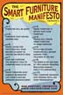
Giant poster, suitable for framing! (300K PDF)
Full text and explanation
Smart Things: Ubiquitous Computing User Experience Design
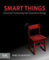
By me!
ISBN: 0123748992
Published in September 2010
Available from Amazon
Observing the User Experience: a practitioner's guide to user research
By me!
ISBN: 1558609237
Published April 2003
Available from Amazon
nice graph. have you checked out the "bling" feature? here's yours with a picture added:
http://www.swivel.com/graphs/show/8758796