There's an interesting lesson about intellectual property in the furniture scene (when seen from the outside, anyway). Much of it is driven by fear. The fear that someone will steal a precious idea, the fear that someone will make it for cheaper, that some key ingredient will be stolen, the fear that you've all stolen the wrong idea.
So what happens? The whole business runs on idea theft. Others' ideas suddenly become as precious as your own, maybe more precious because their value has somehow been proven through theft. This discourages actual innovation. All ideas have to pass through the fear filter: "is it worth stealing?" "Is someone going to steal it?" "Has it already been stolen?" Thus, in the interest of maintaining safely stolen--but not literally plagiarized--ideas, the tides of fashion are created, as the same ideas wash over and through various companies who, all the while, are pretending that each owns the whole ocean.
In fact, this model may actually be a decent representation of how people actually choose things: they evaluate what others are doing and, in the name of originality, do the same thing (at least in America, where the myth of individual self-expression, and the neurosis created because that's actually quite hard to do, runs strong). This is probably the engineer in me talking, but that seems a bit, uh, inefficient. Ideas are actually kind of cheap.
Look at the kitsch furniture scene. Because it doesn't have to conform to the internal logic of the Modernist high design scene, it can be a lot more creative. Partly, that's because it has the option of referencing all of history, not just the period between 1920 and 1960, as the Modernist stuff does incessantly. Even discounting that, the variation of kitsch is pretty huge (although not unlimited: it has rules of its own). This is somewhat counterintuitive, since you'd think kitsch would be based entirely on strict adherence to traditional motifs--kitsch is inherently "conservative" and conservative things work by referencing a mythology of tradition--but when you go through the "Classic" section of the Milan Furniture Fair (as opposed to the "Design" or "Modern" sections), there's actually a lot more variety. The fear disappears and is replaced with an exuberant, if occasionally scary, explosion of design ideas. It's also why Phillipe Starck used the visual language of kitsch to present his gun lamp series:

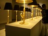
Black, gold, and a traditional form factor allow it to be outside the design mainstream, and thus be acceptable, since the content is clearly so controversial.
Compare that to his other lamp, which firmly stays within the Modernist space:
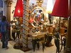
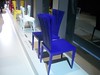
Kitsch
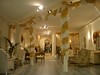
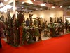
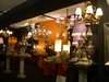
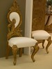
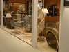
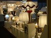
In tribute, here's a mini-gallery of some of the interesting kitsch furniture I saw at the Furniture Fair.
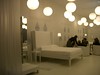
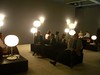
Trends
And here's a list of the trends I saw among the high design furniture at the fair this year. To people who are in the industry, these are probably obvious, but since I don't follow this stuff on a daily basis, it's all new to me. I didn't get pictures of all of them, since some only came to me after the fair was over and I thought about what I had seen.
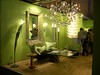
Granny apple green
This year's orange. Greens ranging from pale pastel green to spring green, but never venturing into deeper or earthier shades. What's interesting is that the color in fashion seems to be pink (pale, ranging to hot), which makes me wonder if that's going to be the big color next year, and there's an accepted transition from clothes to furniture. There were a lot of green purses and shirts on sale, but not a lot of pink furniture.
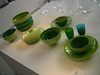


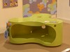
Some people, unfortunately, didn't get the memo:

Flat patterns
There is a lot of borrowing from traditional (read: kitsch) patterns, mostly Victorian wallpaper patterns, and a lot of chandeliers. It's a kind of New New Romanticism. The idea is to flatten the traditional pattern to fit in with Modernism, while presenting a counterpoint to its minimalism. This is done by reducing the number of colors, the pattern to a simple outline or by flattening the shape to a series of flat planes. There were a lot of flat chandeliers. Everyone had a flat chandelier.


Giant lamps
Oversize traditional lampshade shapes were also popular, without any decoration, generally made of plastic.
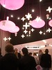
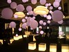
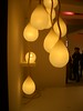
Sphere constellations
This is actually not new, but there were a lot of hanging clusters of spheres. This is certainly a Space Age reference, resurrected, but I like it a lot and there seemed to be more this year than last year. Does this mean a return to the techno Space Age esthetic of the rave scene? There are still a lot of pieces with rounded corners and woodgrain Formica, which are part of the same kit, so maybe it's going to come back soon? Or, more likely, it's just dying at a different rate than some of the more short-lived fashions.
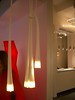
Dangly lamp clusters
Yes, they look like sperm. 'Nuff said.

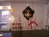
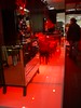
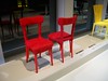
Plush red
Deep red, which goes well with the black Victorian wallpaper when evoking goth Romanticism, was also here in a number of places. It's not a huge movement, but, as in high school, there definitely a market for the vampire/boudoir look, which is essentially the opposite of traditional rational, subdued Modernism. In fact, you could probably go the kitsch section with some red velvet and black spray paint and transform the whole section into a goth paradise (so to speak). It's interesting to see how the coldness of Modernism perpetually creates counteracting styles.
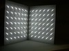
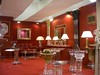
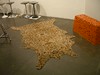
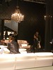
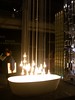
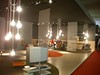
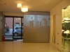
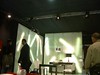
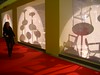
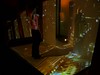
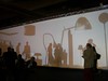
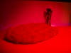
Shadows
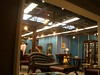
I spent a fair amount of time looking at the presentation of the furniture. I'm doing this ISEA cafe project and so I'm looking at the design of public spaces. The trend I noticed at the Furniture Fair is the extensive use of shadows. Maybe it's traditional theatrical design, but there seemed to be a fair bit of shadow-based presentation, including a nice interactive installation at one company's exibit.


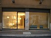
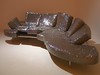
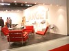
Edra
I wanted to single out one brand for making furniture that I think stands largely outside of the "Modernist versus Romantic" dichotomy I identified:
Edra. They had tremendously inventive, original and exciting designs using a full spectrum of rich colors and innovative materials in unexpected shapes. I really like their stuff, but I don't have a 5000 square foot Batcave to put it in.


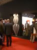
Bonus section: the ultra-knockoffs
It was also interesting to see the logical conclusion of the stolen intellectual property culture, the ultra-knockoffs. These are companies that only copy. Even the names of the companies are, themselves, copies of other companies' names. They are, I suspect, every high design company's worst fear.
Recent Comments